Colour is an essential part of any design project, and this year Furniture News has invited the trend forecasting company behind Mix Publications, Global Color Research, to talk about a key colour for the current season each month, taken from the Mix Trends forecast, which brings relevant information to manufacturers, interior designers and professionals within the design industry. This month, Hannah Malein presents December’s colour, coral orange …
Part of a vibrant and eclectic story, this punchy coral orange brings light and dimension to the elaborate Clash, a key trend for autumn/winter 2013/14. A decorative meeting of minds, Clash takes inspiration from multiple nationalities where we still seek a sophisticated feel but with a more diverse approach.
This blend of information translates into a diverse and layered aesthetic. Although the name Clash might make you think initially of violence and tension, in reality it’s more a celebration of the ornamental. Elements from a mix of eras are revitalised through new juxtapositions. A stylistic hybrid fashioned over generations of intermixing.
Impactful and expressive, this tutti-frutti trend sees lavish elements re-educated in new colourways – a bold mix of vivid and softer tones. New pastels add softness; peach, turquoise and jade green become neutrals of the story, whilst flesh and pearl tones create a peaceful feel. Deep brown and navy blue – an almost black – ground the palette. Rich accents of violet, and the coral energise other colours with a feminine touch, the bright yellow adding a masculine touch to the brights.
High Victoriana and art deco elements all play a role in this unashamedly adorned story. Experimental approaches to colour and pattern create new definitions using traditional techniques. Pattern contrast is key where more than one design adorns surfaces, and classic motifs such as paisleys get an instant refresh in bright hues. Mother-of-pearl inlays add an opulent touch and lend a mystique to everyday objects. Multicoloured plastics in decorative shapes offer new applications for mix-and-match tiling mosaics.
Half way between pink and orange, this colour radiates a welcoming and friendly feel – glowing with warmth and brightness. The name coral, referencing the marine invertebrates, specifically the Algerian species that grows off the coast of the Mediterranean, contrasting beautifully with the turquoise seas. Use this vivid shade in conjunction with both clashing and complementary colours from the Clash palette for a lively and uplifting look.
“This colour radiates a welcoming and friendly feel – glowing with warmth and brightness”
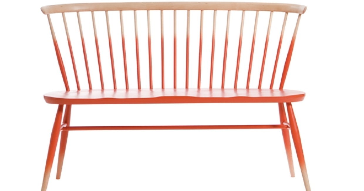
Coral orange tones can be seen adoring a variety of furniture pieces this season, in multiple combinations. Pictured is Zoe Murphy’s bespoke printed furniture, where she uses this month’s colour amongst hues from the Clash palette. Bright coral orange is also featured on the updated classic Ercol chair – which is dipped in the hue, working perfectly with the pale peach wood base.
Use this month’s key colour – coral orange – with an eye-popping mix of turquoise, jade green, violet purple, and bright yellow, and soften off with a soft flesh tone. For the full palette and ideas for its application, see a full presentation of the Clash trend in Mix Trends Autumn Winter issue 25.
Hannah Malein is a colour trend consultant with Global Color Research. Sign up to the monthly Mix Trends newsletter to receive information on colour and design.