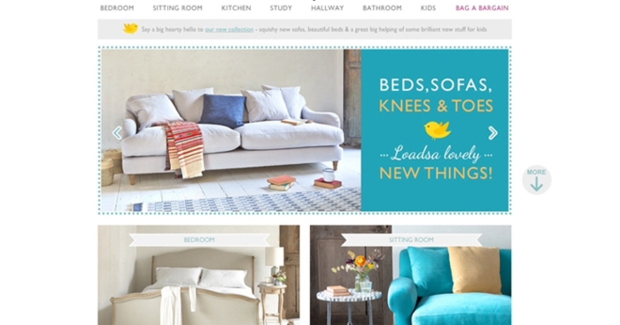
British homeware brand Loaf has redesigned its website in anticipation of plans to launch its first stores. Charlie Marshall, founder of Loaf, believes that online and physical spaces will work more intelligently alongside each other in future. Off the back of its online success, Loaf is looking to launch a series of Loaf Shacks with the website overhaul the first step to creating a multi-channel experience.
The aim of the new website is to become even more user-friendly and to help build customer obsession. Loaf works on the premise that the site needs to be 'so simple that even my mum can use it'. If functionality is intuitive for the non-tech savvy, the expectation is that the majority of customers will have an enjoyable and easy experience too.
Loaf’s in-house team adopted an agile testing process to help react to feedback and incorporate ongoing changes into the 12-month build. All text, content and page components have been reduced by about 90%, opting instead for bigger and better inspirational imagery and eye-catching fonts. A cheerful colour palette keeps things light and information can be absorbed quickly and easily with more symbols and playful illustrations. Important, need to know practical information is presented in simple bite-size sections.
Charlie says: "We want to give our customers a fantastic experience both online and in-store. The move to bricks and clicks is all about reaffirming our brand with the website playing a key part in our future growth." The improvements will contribute to Loaf’s aim of growing sales from £20m (inc VAT for 2013/14) to £100m in the next few years.


