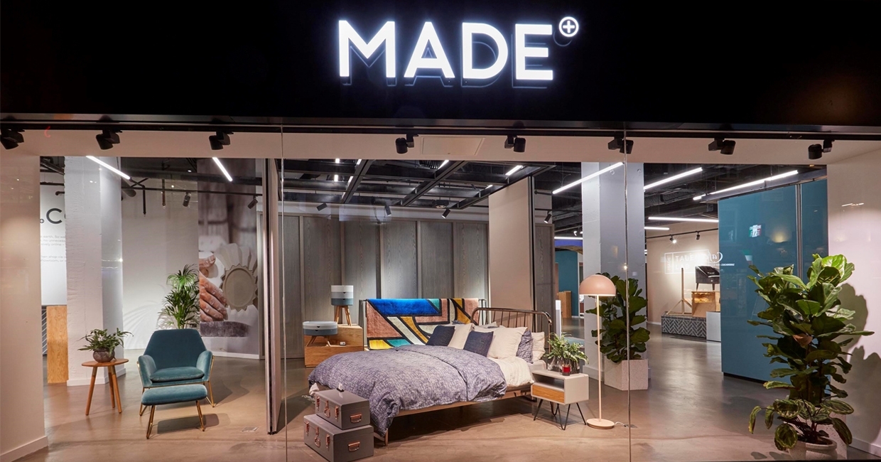
Once an online pureplay, Made has pioneered its own multichannel path – and its physical estate (eight European showrooms, the newest of which opened in July, in Lyon), is underpinned by its London flagship. Situated in the heart of the theatre district, opposite the historic Foyles bookshop, this recently-overhauled space is a fascinating example of clicks-to-bricks retail. Furniture News speaks to Made’s head of showrooms, Jamie Bennett, about the thinking behind it …
“This is not a shop,” reads the welcome sign. True, there’s no evidence of cash desks, pushy salespeople or loud price tags – instead, Made has tried to bring the best elements of its class-leading digital identity in-store, through giant touchscreens, evolving decor and curated designer showcases.
The newly renovated showroom is a contemporary yet playful space, full of fresh design and new technology.
Alongside brand bestsellers, the entrance houses the latest from Made’s TalentLAB initiative, while an archway leads to the main floor, which offers everything from roomsets to plinth-mounted displays. Meanwhile, the rear of the building features a breakout space, touchscreen stations, and a corner in which to discuss interior design.
After working with the likes of Burberry and Aesop, Jamie Bennett joined Made early last year, and was a key agent in the Charing Cross Road renovation – and the project is still close to his heart …
Is Made’s approach what you’re used to?
I’ve always worked at retailers for whom physical stores are the primary outlet, so joining Made has been a really interesting change. Made is a digital-first brand, so understanding that the website and digital experience must be considered at every touchpoint, in addition to providing an amazing human interaction, is something I’ve really enjoyed exploring.
Why refresh this store instead of opening a new one?
To get over 1000 sqm in central London on one level is rare, and our Soho showroom has strong customer awareness.
How did you keep the store ‘on brand’?
Throughout the design process, we engaged extensively with our internal brand stakeholders to ensure we did what felt right for the brand – and, most importantly, what was right for our customers.
As part of this, we evaluated different customer journeys and mindsets to make sure our showroom space met the needs of digital-natives and technophobes alike. Visitors can test out bestsellers in real life, then shop via the app, their smartphones, the large touchscreens in the showroom, or with a team member to complete their purchase.
How are you driving footfall?
We use local out-of-home advertising, our website, our app and our social media channels – all of which have strong customer engagement. We also have seven showrooms throughout Europe, and have used ‘clean graffiti’, Instagram stories and events across all of these to engage with our community.
What’s your favourite aspect of the location?
Soho is incredibly diverse, and this brings a huge range of people in to visit Made, which we love. We get everyone from office workers on their lunch breaks, to people on their way to the theatre and families visiting London at the weekend. So much happens culturally nearby, and it’s also easily accessible for people working in the West End.
Who did you work with on the redevelopment?
We worked with Dan Wilson of Line Interior Architecture. They worked alongside the Made team to design the shopfit elements and overall design. They were involved from the beginning, so the brand’s identity was considered at every stage of the design, which we felt was very important.
Was there any physical redevelopment?
The most significant change was removing the shop front and replacing it with full-length glass, along with moving the entrance to give us three large display windows looking out onto Charing Cross Road.
Since opening, have any unexpected benefits come to light?
The space has been incredibly flexible, which is great. From the beginning, we wanted the Made brand experience in the Soho showroom to be a constantly evolving and adaptable design hub and event space, alongside a constantly updated product selection, and we are loving using the showroom in this way.
Made is always developing its product offering, so having such an open space allows us to easily and accessibly display our new Veloretti bikes, Rains raincoats and bags, luggage, or anything else we launch for our customers.
How many products are on show, and why these in particular?
We have over 500 pieces in the showroom, ranging from cutlery to king-size beds. These represent a mixture of our bestsellers and new and exciting products for our customers to discover.
In the showroom we merchandise partly by category (dine, sleep, etc) to allow for easy browsing, and partly in room sets, to allow customers to see pieces in context and to offer styling advice. We want to strike a balance so customers can see and try our products, whilst also experiencing inspirational styling and designs.
How would you describe the atmosphere?
We wanted the experience to allow the customer to browse in the way they’re comfortable with, so we’ve zoned the space with brand colours, as well as creating neutral areas where clients can have a consultation, look at fabric samples, or browse the website. QR codes allow visitors to get product information using their own devices, but there are always team members available to answer any questions.
How often will the contents/look be overhauled?
Made continually evolves its product range, and we wanted to reflect that in the showroom – so we add new products every week to keep things fresh. To provide consistency for our customers, we change the window displays in line with our campaigns, so people can easily browse and try the products they’ve seen.
How many people work in the showroom?
We have a team of 18, and are very flexible in our approach. Our showroom manager has a lot of autonomy to make the space work – both for our customers and our team.
Describe a typical customer, and your approach to serving them
We see a huge range of people in our showrooms, and have tried to take account of this in designing our visitor experience.
Some clients want a more attentive level of service, so we have our team on hand to help them make what can often be a complex purchase. Some are very happy browsing on their own, and they can use our in-store screens to browse product, print postcards of products they want to buy, find their style using our stylefinder, or shop through our curated Instagram feed. The most important thing is that people feel comfortable in our space.
Have you held any social engagements?
So far this year we’ve had lots of panel talks, events and workshops in the showroom. We’re very lucky to have such a great space in central London, and we want to make sure it’s used to engage with both customers and our wider community, so we’ll continue to develop our programme of events throughout the year.
How is technology incorporated?
Made is a digital-first company, so tech was always going to play a huge part in what we did in-store. However, we recognise that many of our customers come to the showroom for the human interaction, so any tech we introduced had to add value to this interaction, not replace it.
The new technology we’ve introduced includes large HD touch tables which allow clients to view our full catalogue easily, and print postcards to take away with them. We also have smaller touchscreens where clients can place orders and browse the site, and tables where they can have more in-depth consultations with team members.
We wanted to make the tech fun and useful, so the screens offer enhanced browsing, allowing clients to shop by colour, size and style, rather than just by category. We have also equipped our team members with iPhones so they have live product information on the shopfloor to share with customers, rather than having to check on one of the screens.
For us, it’s important that tech adds to the human interaction, making it simpler and more fun.
How does the store work within an omnichannel retail context?
Made is first and foremost a digital retailer – the customer journey will always begin and end online. However, we recognise that a visit to the showroom provides a valuable human connection with the brand.
Rather than just replicating their digital journey in a physical space, we feel it is important to treat the showroom experience as an enhancement and development of our customer journey, offering visitors an opportunity to talk to us directly and experience Made and our products before making a purchase.


