UK homes are shrinking. Last year, research by LABC Warranty found that on average, new-build living rooms are -32% smaller than their 1970s counterparts – in short, the demand for furniture which is functional, flexible, and fits, has never been higher. In this exclusive article, furniture designer Ian Cull explains why and how he developed Cornholme, a fully-featured home office range, with these modern pressures in mind …
Every time I put pen to paper to design a product (or a collection of products) I try to offer as much as I can in terms of features and functionality. I don’t know where that desire comes from – perhaps it’s because I’m a stingy Northerner and just want to ensure people get value for money. Or because I feel that all design should offer that little bit more to differentiate it from the competition. I’ll go with the latter, I think.
Good design shouldn’t cost any more than bad design, and if I can add as much as possible to a reasonably compact package, then I will. From a retail perspective, I’m also giving a salesperson more to talk about, so hopefully there’s more chance of a sale. Most of the products I design – from TV stands to desks – seek to solve the increasing problem of storage in smaller homes.
I’ve known Nicholas Radford of Nathan Furniture for a number of years, and if one furniture brand in the UK aligned itself closely at one time with my way of thinking, it’s Nathan. Looking through Nathan’s back catalogue, it’s clear to me that around the middle of the last century their furniture was being developed to address similar issues around space and storage – as well as being affordable.
I shared my ideas with Nick around 18 months ago, and he was immediately supportive. He gave me unfettered access to Nathan’s production facility so I could begin to turn what was in my head into reality. In all my years working with various factories around the world, I’ve never come across a more capable and responsive factory.
We had no real plan to collaborate at that stage other than from a manufacturing perspective, but I’ve always had a desire to sell my own designs directly to the public one day. After a number of months of development, the Cornholme collection was launched at London Design Fair in September last year. Although it was just prototypes on show, the collection was incredibly well received, with a constant stream of visitors – both trade and public – who were incredibly complimentary.
Following the exhibition, Nick and I sat down and came to the conclusion that it would make a lot of sense for the collection to become part of Nathan’s range – we branded it ‘Ian Cull for Nathan Furniture’.
On home offices
My decision to develop a home office range stemmed from my own situation. I’ve worked from home for almost a decade, and I’m yet to find a piece of furniture that gives me everything I need. Feature-packed products have always been a bit of a theme in my designs, and developing a reasonably compact desk with plenty of storage and other practical features seemed an obvious choice.
It’s also important to me that a piece of furniture differentiates itself stylistically from other lines without being a ‘Marmite’ product. I’m all for simple lines that suit a multitude of interior decor styles. And, although it’s a bit of a cliche, I really do believe that the function of a product dictates its form – to a certain extent.
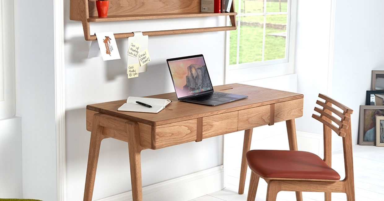
But Cornholme isn’t necessarily just a home office collection. It was definitely designed to be one – yet each piece has a distinct purpose in its own right. The desk won’t look out of place in other areas of the home, and the amount of storage it provides, along with its cable management and wireless charging features, means any clutter can be kept to a minimum.
The wallboard can also be used in isolation. The low-profile design means it will be equally at home in a hallway (the hanging rail is perfect for scarves and umbrellas, for instance), kitchen or bedroom as in an office or study.
On development
The development process for a new collection of furniture always starts off quite simply – with an idea. That idea usually won’t budge out of my head until I begin to get it onto paper in the form of initial hand-drawn sketches. This is the most exciting time of the process, as it’s the first time I can see something physical resulting from the images that have existed in my head for some time.

It’s also the time to begin refining the design, firming up the features and functionality, and addressing some of the detail. The original idea behind Cornholme was for a modular collection, with various elements being put together to form a wider variety of products.
Once I sketched the desk, however, I couldn’t let it go. The more I was able to add into it – in terms of features and functionality – the more I loved the idea. I produced a number of hand-drawn 2D visuals of the desk to resolve its proportions. The restrictions of desktop height, legroom under the desk (always an issue where drawers are present), storage space, cable management, etc, all helped me to finalise the design ready for drawing in CAD.
The key aims were always to produce a visually attractive piece of furniture that would suit any interior decor, and to offer the end-user as many useful features as possible.
The only real change that was made to the original concept was the handle design. I’d originally developed a pop-out leather handle that sat flush with the drawer fronts – indeed, the original prototype was produced with this handle – but it perhaps added a bit too much complexity to the product (even by my terms!), so I thought it’d be safer to revert to a contrasting walnut handle instead.
I was happy to make this change as I think the new handle design looks fantastic, and its concave profile is incredibly tactile. It’s also one of the details of the collection that’s not necessarily apparent at first glance.
One of the most difficult decisions to make was in respect of the hidden wireless charger, mounted centrally at the rear of the desktop. There were two schools of thought – the first, that there needs to be some indication of where the charger is located (originally, I intended there to be a contrasting walnut inlay to show the position of the charger).
The contrasting take was that a hidden wireless charger should be, well … hidden! In the end, I opted for offering no evidence of where the device is positioned, as ultimately once someone purchases the desk they will soon learn where it is (plus we’re including a removable sticker to show where it’s positioned!). When the desk was launched at London Design Fair, the fact that I’d completely hidden the technology was a hit with everyone who came to see it.
On manufacturing
I’ve worked with a number of UK-based manufacturers over the last 20 years or so, and I’m a huge supporter of the sector. My Unity collection, for instance, is entirely manufactured in the UK – in fact, all its components are manufactured within 40 miles of where I’m based in rural Lancashire.
My network of manufacturers, established over my working career, mainly includes component manufacturers (four separate suppliers are involved in the production of my Unity shelf and coat hook, for instance) and I don’t have the facilities yet for assembling larger items of furniture.
But working with overseas manufacturers definitely has its place – and the facilities, skills and materials available from a factory such as Nathan’s in Indonesia can’t be ignored. I’ve worked with manufacturers across Europe and the Far East for over two decades. It’s very rare that I work with a manufacturer without a visit to their factory floor at some stage, but in the case of Nathan’s factory in Indonesia I haven’t had to worry about that.
From the moment I shared the initial concept sketches with them it was clear they possessed a great understanding of what I was trying to achieve, as well as the capabilities to turn it into reality without having to make any compromises along the way. Each piece in the collection is far from straightforward to manufacture, but I’ve been met with nothing but positivity and a great deal of support throughout the entire process.
On the future
After its success at London Design Fair, I’m planning on taking Cornholme – perhaps with some new products – to events later this year. For now, the collection can be seen at Nathan’s showroom in Radstock, Somerset, or at my studio near Chorley in Lancashire.
I’m handling all the direct retail sales through my own website, whilst all trade orders are processed by Nathan, therefore taking advantage of their well-established warehousing and distribution network. We’re both looking for more retail stockists, and the initial stock is due in their warehouse next month.
Ian Cull works from an office in Salford and a studio and workshop in Brinscall, Lancashire. He studied at the University of Salford, where he earned a BSc (Hons) in Product Design & Development, before going on to work with some of the UK’s biggest retailers – both in-house and on a freelance basis. Through his business, Ian Cull Furniture Design, Ian works closely with manufacturers across the UK, Europe and the Far East to develop furniture and accessories which are clean, contemporary and commercial, yet retain a British character. His resume lists the likes of Stil Furniture, Alphason, Moventi and Profili, yet his white-label work is far more prolific than this summary would suggest.


